
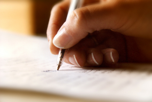
글쓰기 and 디자인 have always been two passions of mine. When someone first approached me with a 글쓰기 opportunity for their blog, I was shocked. It hadn’t crossed my mind for a moment that the two could be brought together harmoniously. I still remember 글쓰기 that 기사 and building my first brainstorm of topics. I found myself asking, "What makes a good article?"
But, to hell with good articles. Anyone can write a good article. I wanted something that would floor everyone–that would make everyone say, "Who the heck is this guy, and why haven’t I read his stuff before?"
I’m always trying to take things to the 다음 level, so I asked, "What makes an amazing article?"
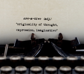
Content is King
That’s right. We’ve heard it time and time again. As designers, it can be something that frustrates us. We make superior aesthetic creations for our clients, but we don’t have much say in what they do with it afterwards. Generally speaking, it isn’t our job to write the content, even though the content is what can make 또는 break the website.
Users will check out a site once and bask in its beauty, but the content is what will make them come back.
Know your readers
It’s very helpful to pick a subject for your writing. Know what your users like to read, and pay attention to trending topics in the industry to know what your readers are going to be interested in reading.
Original content
It can be frustrating to come up with a topic, only to 검색 it in 구글 and find a similar 기사 already written. Since everyone and their pet retriever is blogging, we find topics that have been "rehashed" over and over. As a reader, I find myself hitting my head wondering what some people are thinking when they write 기사 that have clearly been written before (sometimes even with the same title).
Suffice to say that since so many people are blogging now (especially in such a large community as design), it is very difficult to find topics that haven’t been talked about.
But this is our job as writers – we need to find topics that our readers will be interested in, and write about them in a creative way. Sure, our style of 글쓰기 will greatly affect an article’s originality, but we need to attack points from different angles.
This doesn’t mean taking an 기사 about "How To Get a Ketchup Stain Out of Your White Shirt" and changing it to "How NOT To Get a Ketchup Stain Out of Your White Shirt", but figuring out different ways to get that stain out, and elaborating on content and points 당신 thought weren’t emphasized enough in 이전 articles.
Style and Flow
Style is something very personal to writers. I find myself 읽기 content of several writers not based on what they’re writing, but based on their style.
As a writer, the first thing 당신 need to create is your style and the personality that comes through your writing. This should often come easy as 당신 write, and it will build over time, but the style 당신 create will greatly determine who will come back.
There are a lot of well thought-out 기사 out there, but some of them are too all over the place for me. Make sure that in your 글쓰기 you’re moving from point to point smoothly. Keep on topic, and make every 기사 a story.
Be ready for criticism
Know what you’re talking about, and edit, edit, edit. I like to think of every 기사 I put out as important as a legal document. 디자인 is such a broad topic that not everyone knows everything, and everyone has different experiences. So don’t be surprised when someone leaves a 코멘트 that leaves 당신 baffled as to how 당신 should respond.
After my final round of edits and before publishing, I like to look over my 기사 in a different way. Back in high school, I was a key debater on my school’s team. Our coach had always taught us to look over our speeches as a competitor, and to find holes in what we were saying. If we find holes, we patched them up. If something we said was debatable, we made sure we knew how to refute points. This way, we wouldn’t be (as) baffled when they picked at one of our points.
Every blogger who has been around a while has had this comment, but we all learn from it. 당신 find that your audience has a voice and opinions as well, and 당신 need to make sure that what you’re saying is politically correct in every way. Not only this, but 당신 have to be ready to 토론 the points in your article. Be ready to know what you’re talking about so 당신 don’t look like an idiot.
디자인 is the Shiny 옷, 가운 and Crown
I can’t take credit for this headline – DesignBump wrote a nice little 기사 on what 디자인 is in relation to content that I think 당신 should read as well. If you’re proud of your content, make sure that it’s looking how 당신 did when 당신 went to your high school prom.
Typography
I find myself moving through different fetishes in design, and I’ve been stuck for the past few months on typography. So much so, that I’ll go into a website’s CSS just to find out what line-height and letter-spacing people are using to make their content 더 많이 readable. There are a few principles we should meet when dealing with typography for the web:
Maintain a hierarchy
We should all know the difference between serif and sans-serif fonts. Sans-serif fonts should be used for titles, and serif fonts should only be used for body text. Make sure that 당신 create a hierarchy of titles that uses the proper font and also visually breaks down the content. No one likes big blocks of content. Having contrasting typefaces will help clearly distinguish a hierarchy.
Maintain structure
Make sure that your typefaces are legible and your content is readable. Generally speaking, a measure (or line of text) should be contained within 2-3 alphabets (or the equivalent to 52-78 characters including spaces). When you’re designing, using grid systems can help heaps with making sure that everything is readable.
Adjust your CSS accordingly
당신 should always adjust your font size (using relative sizes like ems and percentages) accordingly, paying close attention to your line-height and the color you’re using. Since most websites have blocks of unindented text, 당신 should create extra padding at the bottom of your paragraphs to compensate for this.
Line-heights should generally be set to 1.5em including the approximate pixel-value to the bottom of paragraphs to maintain consistency.
Using font styling appropriately
As we’ll discuss in the 다음 section, large blocks of text are very boring. Use font styling such as bold and italic/oblique to emphasize points in your content.
Graphics
읽기 blocks of text are boring. We’re designers, so we have the ability to go into Photoshop and throw something even simple together to break up our blocks of text. Generally speaking, readers of online magazines like to skim content. Having interesting content using the above along with interesting 이미지 will interest them in 읽기 what you’ve written. If you’re good with graphs, use graphs as well to layout statistical information.
What do 당신 think makes an web content?
The 디자인 community is a very tough community to write for and hold an audience with so many other great blogs out there. I don’t know about some of you, but I sometimes come across 기사 from the other side of the Internet that is still stuck in a 1990′s-style 디자인 with amazing content, and I can’t read it. However, for some reason I’ll read garbage 게시됨 on some nicer-designed websites just because I think the typography is pretty. Therefore, the right balance of content and 디자인 is what will create a truly amazing article.
Here are some 기사 to get 당신 started on improving your web content:
The Death of the Boring Blog Post (via Smashing Magazine)
글쓰기 User Friendly Content (via UX Booth)
A Guide To 글쓰기 Effectively About 디자인 (via Tripping Words)
But, to hell with good articles. Anyone can write a good article. I wanted something that would floor everyone–that would make everyone say, "Who the heck is this guy, and why haven’t I read his stuff before?"
I’m always trying to take things to the 다음 level, so I asked, "What makes an amazing article?"
Content is King
That’s right. We’ve heard it time and time again. As designers, it can be something that frustrates us. We make superior aesthetic creations for our clients, but we don’t have much say in what they do with it afterwards. Generally speaking, it isn’t our job to write the content, even though the content is what can make 또는 break the website.
Users will check out a site once and bask in its beauty, but the content is what will make them come back.
Know your readers
It’s very helpful to pick a subject for your writing. Know what your users like to read, and pay attention to trending topics in the industry to know what your readers are going to be interested in reading.
Original content
It can be frustrating to come up with a topic, only to 검색 it in 구글 and find a similar 기사 already written. Since everyone and their pet retriever is blogging, we find topics that have been "rehashed" over and over. As a reader, I find myself hitting my head wondering what some people are thinking when they write 기사 that have clearly been written before (sometimes even with the same title).
Suffice to say that since so many people are blogging now (especially in such a large community as design), it is very difficult to find topics that haven’t been talked about.
But this is our job as writers – we need to find topics that our readers will be interested in, and write about them in a creative way. Sure, our style of 글쓰기 will greatly affect an article’s originality, but we need to attack points from different angles.
This doesn’t mean taking an 기사 about "How To Get a Ketchup Stain Out of Your White Shirt" and changing it to "How NOT To Get a Ketchup Stain Out of Your White Shirt", but figuring out different ways to get that stain out, and elaborating on content and points 당신 thought weren’t emphasized enough in 이전 articles.
Style and Flow
Style is something very personal to writers. I find myself 읽기 content of several writers not based on what they’re writing, but based on their style.
As a writer, the first thing 당신 need to create is your style and the personality that comes through your writing. This should often come easy as 당신 write, and it will build over time, but the style 당신 create will greatly determine who will come back.
There are a lot of well thought-out 기사 out there, but some of them are too all over the place for me. Make sure that in your 글쓰기 you’re moving from point to point smoothly. Keep on topic, and make every 기사 a story.
Be ready for criticism
Know what you’re talking about, and edit, edit, edit. I like to think of every 기사 I put out as important as a legal document. 디자인 is such a broad topic that not everyone knows everything, and everyone has different experiences. So don’t be surprised when someone leaves a 코멘트 that leaves 당신 baffled as to how 당신 should respond.
After my final round of edits and before publishing, I like to look over my 기사 in a different way. Back in high school, I was a key debater on my school’s team. Our coach had always taught us to look over our speeches as a competitor, and to find holes in what we were saying. If we find holes, we patched them up. If something we said was debatable, we made sure we knew how to refute points. This way, we wouldn’t be (as) baffled when they picked at one of our points.
Every blogger who has been around a while has had this comment, but we all learn from it. 당신 find that your audience has a voice and opinions as well, and 당신 need to make sure that what you’re saying is politically correct in every way. Not only this, but 당신 have to be ready to 토론 the points in your article. Be ready to know what you’re talking about so 당신 don’t look like an idiot.
디자인 is the Shiny 옷, 가운 and Crown
I can’t take credit for this headline – DesignBump wrote a nice little 기사 on what 디자인 is in relation to content that I think 당신 should read as well. If you’re proud of your content, make sure that it’s looking how 당신 did when 당신 went to your high school prom.
Typography
I find myself moving through different fetishes in design, and I’ve been stuck for the past few months on typography. So much so, that I’ll go into a website’s CSS just to find out what line-height and letter-spacing people are using to make their content 더 많이 readable. There are a few principles we should meet when dealing with typography for the web:
Maintain a hierarchy
We should all know the difference between serif and sans-serif fonts. Sans-serif fonts should be used for titles, and serif fonts should only be used for body text. Make sure that 당신 create a hierarchy of titles that uses the proper font and also visually breaks down the content. No one likes big blocks of content. Having contrasting typefaces will help clearly distinguish a hierarchy.
Maintain structure
Make sure that your typefaces are legible and your content is readable. Generally speaking, a measure (or line of text) should be contained within 2-3 alphabets (or the equivalent to 52-78 characters including spaces). When you’re designing, using grid systems can help heaps with making sure that everything is readable.
Adjust your CSS accordingly
당신 should always adjust your font size (using relative sizes like ems and percentages) accordingly, paying close attention to your line-height and the color you’re using. Since most websites have blocks of unindented text, 당신 should create extra padding at the bottom of your paragraphs to compensate for this.
Line-heights should generally be set to 1.5em including the approximate pixel-value to the bottom of paragraphs to maintain consistency.
Using font styling appropriately
As we’ll discuss in the 다음 section, large blocks of text are very boring. Use font styling such as bold and italic/oblique to emphasize points in your content.
Graphics
읽기 blocks of text are boring. We’re designers, so we have the ability to go into Photoshop and throw something even simple together to break up our blocks of text. Generally speaking, readers of online magazines like to skim content. Having interesting content using the above along with interesting 이미지 will interest them in 읽기 what you’ve written. If you’re good with graphs, use graphs as well to layout statistical information.
What do 당신 think makes an web content?
The 디자인 community is a very tough community to write for and hold an audience with so many other great blogs out there. I don’t know about some of you, but I sometimes come across 기사 from the other side of the Internet that is still stuck in a 1990′s-style 디자인 with amazing content, and I can’t read it. However, for some reason I’ll read garbage 게시됨 on some nicer-designed websites just because I think the typography is pretty. Therefore, the right balance of content and 디자인 is what will create a truly amazing article.
Here are some 기사 to get 당신 started on improving your web content:
The Death of the Boring Blog Post (via Smashing Magazine)
글쓰기 User Friendly Content (via UX Booth)
A Guide To 글쓰기 Effectively About 디자인 (via Tripping Words)


" Mom, why did 당신 and Papa get divorced?" asked Lydia. Miss. Pheonix sighed. She waited a few 초 till she replied," Sweet heart, if I tell you, 당신 shall not tell anyone ok?" Lydia nodded."Well it's a pretty simple story. I'll try to tell it in a short way as possible. Papa and I got divorced beacausehe fell in 사랑 with another girl." said Miss. Pheonix. "But Mother! I'm old enough to know more!" pleaded Lydia. Ms. Pheonix shook her head slowly. Lydia left the room quietly and slowly walked to her room. Lydia was already 16 now and her mom thought she still wasn't mature enough. She sat on her bed. Suddenly, a girl appeared to her. "Who are you? Why are 당신 here?" asked Lydia. "I'm Enchantical Essence. A fairy to be exact.Who are you?" said the girl."I'm Lydia Pheonix. Now why are 당신 in my room?!"........
TO BE CONTINUED