
This is not a well planned, elaborate 기사 on accepting change and what we can do to make it better. This is a series of thoughts, 질문 and sarcastic 코멘트 taken mostly from messages between link and link about why we are not 팬 of the Facepop Makeover of July 2010. If 당신 would like to read an 기사 about accepting the change, exploring some of the finer parts of the makeover and moving on, please read link 기사 의해 Fanpop's amazing link. Actually, 당신 should probably read that anyway if you’re at all concerned about the makeover.
A BRIEF HISTORY LESSON.
One of the things Missy and I have always loved about 팬팝 is that it was… well, Fanpop. (Most of) the people were great, lots of cool content, the creators were down to earth guys who actually talked to the users and cared about what they had to say (I still 사랑 당신 guys even though I hate this new layout with a fiery passion!). It had a nice, simple, clean layout. It was original, not like most of the up-and-coming sites that are essentially ripoffs of 더 많이 인기 sites like MySpace and Facebook.
We’ve been here since 2007. Some call us “the old people”. We are not normally 팬 of change. But before 당신 write this off with a “Oh great, it’s just Missy & Dasm bitching about the smallest change again,” please at least skim this article. I may be a bit biased, ‘cause I helped write it, but I believe there are some interesting points below.
LADIES & GENTS, I GIVE YOU... FACEPOP. (Or: THE WALL)
There was a repeat pick in the 팬팝 spot the other 일 about whether 팬팝 또는 페이스북 was better. 팬팝 has won every one of those picks! There is a message in that.
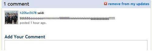
Aside from the fact that walls are thought of as a 페이스북 thing, this is going to open up a world of pain, as trolls and spammers can now abuse whole spots and individuals much 더 많이 easily now.
I think almost everyone can agree that the 벽 box is ridiculously large. Downsize, please.
Why didn't the site test the feature on a small group first, so that issues like expanding 코멘트 and the 신고 function could already work before releasing it to everyone?
Yes, it has been asked in the past and the slight majority wanted something similar to a wall. One thing that needs to be taken into account is that the people who wanted "comment walls" and such were the same people who wanted personalized backgrounds for their profiles etc. Those were the same kind of users who just wanted it to be all sparkles and hearts like their MySpace accounts.
THE LAYOUT.
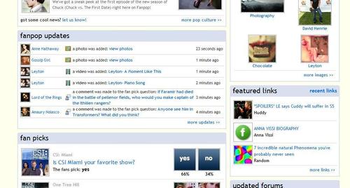
Despite hiding half the features & content, the new layout makes the pages look so much 더 많이 cluttered. 정크 like 인기 content and the mind-blowing four 업데이트 are all on the right side while everything else is overlapped on the left.
No 링그 on the main page of a spot? And 기사 way down the bottom of the page where no one will look? Great.
포럼 were already ignored, now they're basically useless. Older users will still know their purpose, and hopefully where to find them, but why would a n00b post a 포럼 for discussion when there's a gigantic 벽 they can write on, right on the spot's 집 page?
This screws over quizzes, too - forget that whole 'I'm here for a purpose, but ooh, I know the answer to that 퀴즈 'cause it's right there where I can see it!' thing. This was one of Fanpop’s coolest features and now it’s hidden just like 비디오 and forums.
...but 의해 all means, put the 답변 section right where everyone can see it, it's not abused 의해 98% of the site 또는 anything.
After trying for ages to get it drilled into the heads of uploaders, even putting a note on the 업로드 page itself, about adding 이미지 with link, guess what? Image names don't show up on a spot's 집 page.
THREE SEARCHBARS in a spot?! THREE searchbars for people to ignore?! The placement of the new 검색 bar commands 더 많이 attention, so I can accept that. But THREE searchbars per spot?! (Black Bar of Doom for site-wide searching, Grey Bar for spot, and now another spot 검색 in spots that don’t have 벽 posts yet.)
What determines 인기 content? Personally, I've never paid any attention to it and now it's taking up half my page.
It seems that most of the spots I checked that have no 퀴즈 have the 'quizzes' tab shown in default instead of the 'picks'. What determines which tab is shown on individual pages?
Putting 기사 all the way down at the bottom and the "wall" up the 상단, 맨 위로 functions to totally devalue article-writing while promoting Twitter like "Oh LOlz i ? FanPOp!!!!!!!1" contributions. It will also probably scare off potential new users over the age of 12. Nobody loves a crazed fangirl.
USER 프로필 CHANGES.
"Club Activity" is a pain in the 나귀, 엉덩이 to navigate through. With the old system, once 당신 were in a user's activities, it only took a click to get where 당신 wanted. Why did that get 더 많이 complicated?
The link to props on the 프로필 header is gone, now the only way to get to them is to click the prop 아이콘 또는 go through the wall.
...but there is a link to "photos" which leads to -waitforit- the user's gallery. Which can also be accessed 의해 clicking "more photos" 다음 to the user's icon, the 아이콘 itself, 또는 the tiny thumbnails of other 아이콘 in the user’s gallery.
In order to get to the picks a person has made, 당신 now have to go through the picks section in the "my club activity" menu (instead of being able to see it from the 'activity' section).
As of now, I haven't found out how to find the 퀴즈 질문 a user has made through navigation (other than just typing it in the 주소 bar). The 퀴즈 page allows 당신 to sort the 퀴즈 the user has taken, but nothing on the ones they made.
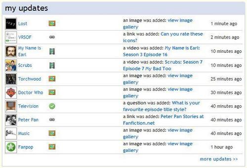
Each user now has link on their page for "updates" which only leads to the 집 page. The status bar looks like it's going to take 당신 to the 업데이트 for the spots the users is a part of (fanpop.com/fans/username/updates/filtered), but last I checked, 당신 could only see your own updates. Which would be why it's redirecting to the 집 page. Also, why would 당신 need to see the 업데이트 for someone else's spots?
THE BURNING QUESTIONS.
Why has this kind of "makeover" been given priority over other issues such as the repeated failures of the reporting system, the 자주 묻는 질문 that hasn’t been updated in ages, the insanity of the duplicate spots issue, and the tons of worthwhile suggestions in Dave’s link?
A BRIEF HISTORY LESSON.
One of the things Missy and I have always loved about 팬팝 is that it was… well, Fanpop. (Most of) the people were great, lots of cool content, the creators were down to earth guys who actually talked to the users and cared about what they had to say (I still 사랑 당신 guys even though I hate this new layout with a fiery passion!). It had a nice, simple, clean layout. It was original, not like most of the up-and-coming sites that are essentially ripoffs of 더 많이 인기 sites like MySpace and Facebook.
We’ve been here since 2007. Some call us “the old people”. We are not normally 팬 of change. But before 당신 write this off with a “Oh great, it’s just Missy & Dasm bitching about the smallest change again,” please at least skim this article. I may be a bit biased, ‘cause I helped write it, but I believe there are some interesting points below.
LADIES & GENTS, I GIVE YOU... FACEPOP. (Or: THE WALL)
There was a repeat pick in the 팬팝 spot the other 일 about whether 팬팝 또는 페이스북 was better. 팬팝 has won every one of those picks! There is a message in that.
Aside from the fact that walls are thought of as a 페이스북 thing, this is going to open up a world of pain, as trolls and spammers can now abuse whole spots and individuals much 더 많이 easily now.
I think almost everyone can agree that the 벽 box is ridiculously large. Downsize, please.
Why didn't the site test the feature on a small group first, so that issues like expanding 코멘트 and the 신고 function could already work before releasing it to everyone?
Yes, it has been asked in the past and the slight majority wanted something similar to a wall. One thing that needs to be taken into account is that the people who wanted "comment walls" and such were the same people who wanted personalized backgrounds for their profiles etc. Those were the same kind of users who just wanted it to be all sparkles and hearts like their MySpace accounts.
THE LAYOUT.
Despite hiding half the features & content, the new layout makes the pages look so much 더 많이 cluttered. 정크 like 인기 content and the mind-blowing four 업데이트 are all on the right side while everything else is overlapped on the left.
No 링그 on the main page of a spot? And 기사 way down the bottom of the page where no one will look? Great.
포럼 were already ignored, now they're basically useless. Older users will still know their purpose, and hopefully where to find them, but why would a n00b post a 포럼 for discussion when there's a gigantic 벽 they can write on, right on the spot's 집 page?
This screws over quizzes, too - forget that whole 'I'm here for a purpose, but ooh, I know the answer to that 퀴즈 'cause it's right there where I can see it!' thing. This was one of Fanpop’s coolest features and now it’s hidden just like 비디오 and forums.
...but 의해 all means, put the 답변 section right where everyone can see it, it's not abused 의해 98% of the site 또는 anything.
After trying for ages to get it drilled into the heads of uploaders, even putting a note on the 업로드 page itself, about adding 이미지 with link, guess what? Image names don't show up on a spot's 집 page.
THREE SEARCHBARS in a spot?! THREE searchbars for people to ignore?! The placement of the new 검색 bar commands 더 많이 attention, so I can accept that. But THREE searchbars per spot?! (Black Bar of Doom for site-wide searching, Grey Bar for spot, and now another spot 검색 in spots that don’t have 벽 posts yet.)
What determines 인기 content? Personally, I've never paid any attention to it and now it's taking up half my page.
It seems that most of the spots I checked that have no 퀴즈 have the 'quizzes' tab shown in default instead of the 'picks'. What determines which tab is shown on individual pages?
Putting 기사 all the way down at the bottom and the "wall" up the 상단, 맨 위로 functions to totally devalue article-writing while promoting Twitter like "Oh LOlz i ? FanPOp!!!!!!!1" contributions. It will also probably scare off potential new users over the age of 12. Nobody loves a crazed fangirl.
USER 프로필 CHANGES.
"Club Activity" is a pain in the 나귀, 엉덩이 to navigate through. With the old system, once 당신 were in a user's activities, it only took a click to get where 당신 wanted. Why did that get 더 많이 complicated?
The link to props on the 프로필 header is gone, now the only way to get to them is to click the prop 아이콘 또는 go through the wall.
...but there is a link to "photos" which leads to -waitforit- the user's gallery. Which can also be accessed 의해 clicking "more photos" 다음 to the user's icon, the 아이콘 itself, 또는 the tiny thumbnails of other 아이콘 in the user’s gallery.
In order to get to the picks a person has made, 당신 now have to go through the picks section in the "my club activity" menu (instead of being able to see it from the 'activity' section).
As of now, I haven't found out how to find the 퀴즈 질문 a user has made through navigation (other than just typing it in the 주소 bar). The 퀴즈 page allows 당신 to sort the 퀴즈 the user has taken, but nothing on the ones they made.
Each user now has link on their page for "updates" which only leads to the 집 page. The status bar looks like it's going to take 당신 to the 업데이트 for the spots the users is a part of (fanpop.com/fans/username/updates/filtered), but last I checked, 당신 could only see your own updates. Which would be why it's redirecting to the 집 page. Also, why would 당신 need to see the 업데이트 for someone else's spots?
THE BURNING QUESTIONS.
Why has this kind of "makeover" been given priority over other issues such as the repeated failures of the reporting system, the 자주 묻는 질문 that hasn’t been updated in ages, the insanity of the duplicate spots issue, and the tons of worthwhile suggestions in Dave’s link?


this week, 팬팝 reach the of unffair:
so, i 가입하기 to fp, like a 년 ago, but i only start to contribute in janurary +- . for a long time my only contibutuons were for the Brtieny Spears Spot.
Here's My Contributions:
Links- 18
Videos- 600
Images- 3574
Comments- 49
Forums- 7
Picks- 110
Quizzes- 36
Articles- 5
Until last week i was the #1 팬 on the spot, and i still have a "Die-Hard Medal", but now in #2. So i check the profile, of the new #1 fan- shopialover, and she have a "Fanatic Medal", now see what she contribued:
Links- 1
Videos- 467
Images- 805
Comments- 51
Forums- 0
Picks- 2
Quizzes- 0
Articles- 0
I Was Like, are 당신 kidding me?, this is so unffair, i 로스트 a lot of time uploading pictures and add video and thinkin in original picks! Could this be 더 많이 unffair?
ANYONE WITH ME?