Regardless of the intended character... The form is good, basic, but good. In the future, I'd suggest adding 더 많이 depth. 더 많이 texture overall, shading, specific detail, and highlighting -- specifically in the hair. Make it as realistic as possible, and most of all: KEEP AT IT!
My drawings used to look a lot like this, and trust me, 당신 will improve if 당신 keep going!
당신 can do this too, that's all I'm saying. Because I know how discouraged artists can feel.
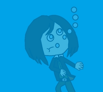
The 사무용 겉옷, 전반적인 image is pretty good, but in my opinion the bubble sizes could be 더 많이 varied and the blue overlay could be a bit 더 많이 dimensional, too (I like the effect it gives, but like, perhaps in a few 더 많이 different shades of blue, does that make any sense??)
posted over a year ago
Oh, thanks.. I'll be sure to make It look a bit like that.
The eyes have nothing to them, just circles with colour, the hair is EXTREMELY flat, the body and head are messed up, the arms aren't right, the hands look like octopuses and the legs make no sense.
1st of all...YES, his names Daniel. 2nd of all.... He knew he was above water so he landed on his feet. and 3rd of all......uh... What does that mean? I dont know how to read that...